
In today’s digital age, where smartphones and tablets have become an integral part of our lives, it’s crucial for businesses to adapt to changing user behaviours.
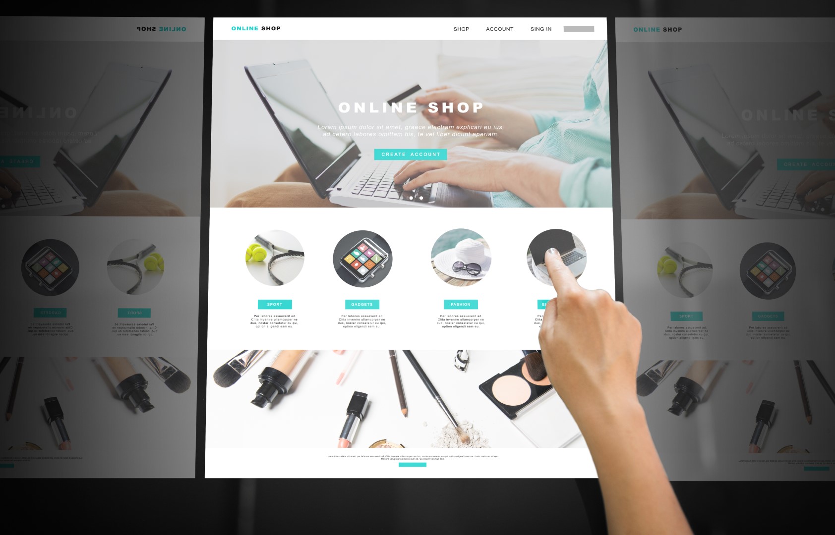
Mobile devices are now the primary means through which people access the internet, making responsive web design an absolute necessity. In this article, we’ll delve into the significance of responsive web design and its profound impact on mobile user experience. We’ll also provide essential tips and best practices for optimizing websites for various screen sizes.
Understanding Responsive Web Design
Responsive web design is a design approach that ensures a website adapts to the screen size and orientation of the device being used to access it. This approach allows web pages to be viewed effectively on a wide range of devices, from large desktop monitors to small smartphone screens.
The primary goal of responsive web design is to create a seamless and user-friendly experience for all users, regardless of the device they use. This approach is in stark contrast to the older method of maintaining separate desktop and mobile websites, which was both inefficient and costly.
The Significance of Responsive Web Design
- Enhanced User Experience: Responsive web design directly impacts the user experience by ensuring that content is legible, images are clear, and navigation is easy, no matter the device. This leads to higher user satisfaction and engagement.
- Improved SEO: Search engines, such as Google, prioritize responsive websites in their rankings. A responsive design can positively affect your website’s search engine visibility and lead to higher organic traffic.
- Cost-Effectiveness: Maintaining a single website that adapts to various screen sizes is more cost-effective than managing multiple websites. It reduces development, maintenance, and content management expenses.
- Increased Accessibility: Responsive web design aligns with web accessibility standards, making your site more accessible to users with disabilities. This inclusivity can enhance your website’s reach and user base.
- Lower Bounce Rates: Responsive designs are more likely to retain visitors on your site. When users encounter a mobile-unfriendly website, they are more likely to bounce, leading to missed opportunities for engagement or conversion.
- Adaptation to the Mobile-First Era: As mobile usage continues to rise, a responsive web design is critical for businesses to remain competitive and effectively reach their target audience.
Tips and Best Practices for Responsive Web Design

- Mobile-First Approach: Start with the smallest screen size (mobile) when designing your website. This ensures that you prioritize the most critical content and features for mobile users.
- Flexible Grids and Layouts: Use flexible grids and layouts that adapt to various screen sizes. Employ CSS media queries to define breakpoints where the layout changes.
- Optimize Images: Use responsive images that load quickly on mobile devices. Implement techniques like lazy loading and image compression to reduce load times.
- Consistent Navigation: Keep navigation menus and site structure consistent across all devices. Mobile users should have easy access to all essential site sections.
- Touch-Friendly Design: Ensure that buttons and interactive elements are touch-friendly, with enough spacing between elements to prevent accidental taps.
- Readable Typography: Choose legible fonts and font sizes. Text should be easily readable without zooming, and line lengths should be manageable on smaller screens.
- Content Prioritization: Prioritize content and display it in a mobile-friendly hierarchy. Avoid cluttering the screen with unnecessary elements.
- Optimize Page Speed: Pay attention to performance optimization. Minimize HTTP requests, reduce unnecessary scripts, and utilize content delivery networks (CDNs) to speed up load times.
- Test on Real Devices: Test your responsive design on various real devices to ensure a consistent and smooth user experience.
- Regular Updates: Continuously monitor and update your responsive design to adapt to evolving device sizes and screen resolutions.


